How I automated the architecture and specification of a tokenized design system for RMM using AI agents, ensuring WCAG 2.2 compliance and zero technical debt between Figma and code.
This is what an RMM specialist said during interviews. The diagnosis was clear: raw tables and an excessive density of alerts caused cognitive overload and delayed responses to critical incidents.
Decision: I started by benchmarking RMM tools to map competitor pain points. Instead of wasting time drawing components manually in Figma, I built a flow with AI agents to generate and test the tokenized structure directly in code. I maintained strategic leadership of the process, applying my visual eye and WCAG 2.2 rigor with human validation.
Evidence of impact:
Component Showcase
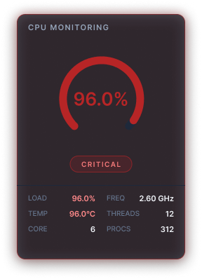
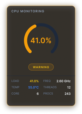
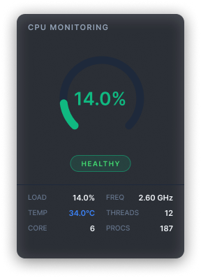
Visual examples of the design system in action
CPU Card Critical
CPU Card Warning
CPU Card Healthy
Asset status menu
(healthy, warning, critical, offline)
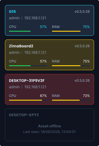
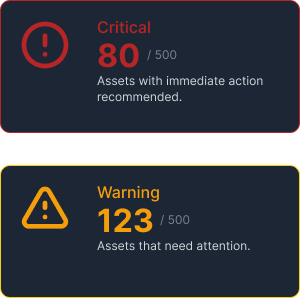
StatCards Critical + Warning
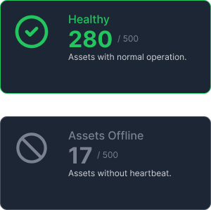
StatCards Healthy + Offline
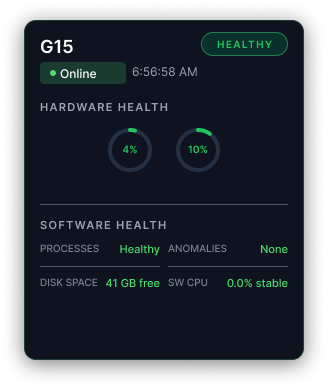
Healthy Asset
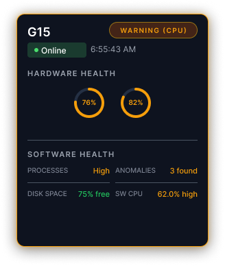
Warning Asset
Critical Asset
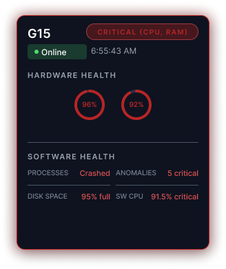
Offline Asset
Executive Summary
Role: Product Design Lead, Systems Architect and Prompt Engineer on the Sentinel Health product.
Real conflict
RMM tools tend to clutter the screen. You spend the day reacting to alerts instead of solving problems. One specialist told me it felt like “staring at the Matrix”. Data was not lacking. What was lacking was an information architecture that turned raw logs into fast decisions.
Decision I made
I mapped the RMM market to identify where competitors' experience failed. To focus on strategy rather than manual execution in Figma, I created an AI-agent-orchestrated flow (UI Generator, Design Critique, UX Copywriter, and Technician Persona) that automates the specification and testing of tokens in code. I maintained leadership of the system, ensuring UI design validation, usability, and accessibility rigor.
Discarded options
- Traditional Figma-to-Code flow: Slow process, prone to misalignment (drift), and unable to keep up with the agents' speed.
- Generic dashboard: It does not solve the core problem of “hunting anomalies in tables”.
- More alerts and colors on the dashboard: They would only increase visual pollution and cognitive load, the opposite of the goal.
Evidence
95% autonomous decisions 500+ workstations WCAG 2.2 AA 268 tokens in the Design System Zero visual tech debt
Main trade-off
I prioritized tokenized architecture, accessibility, and cognitive-load reduction instead of delivering a gallery of pretty screens. Micro-interactions and light mode were left in the backlog for future implementation. In exchange, every color, spacing, and contrast value has a clear technical purpose.
1. Diagnosis: The Cognitive Load of the “Matrix”
The product was built from scratch to solve a chronic pain reported in interviews and mapped in benchmarking: the excess of data and logs in market tools created extreme visual load, “it was like staring at the Matrix”. What was lacking was an information architecture capable of converting raw data into fast decisions.
- Market scenario: Traditional tools based on raw tables and manual anomaly hunting.
- New approach: Predictive interface built from scratch with accessible, tokenized components and human validation.
- Real constraints:
- Lean team: Solo execution (Design/Code) with direct validation by the subject-matter expert (SME).
- Deadline & scale: 4 months of development and stress testing to support 500+ simultaneous assets.
- Monitoring environment & Accessibility: Dark mode interface for continuous use, with color architecture and triple redundancy (color, icon, and text) designed by me (a colorblind designer), ensuring real visibility even in severe color blindness cases.
- Hypothesis: AI agents generate and critique components before human review.
From market standard to predictive surface
Market standard in RMM tools (left) vs. Sentinel Health's predictive and accessible interface (right). Color, shape, and text aimed at fast decision-making.
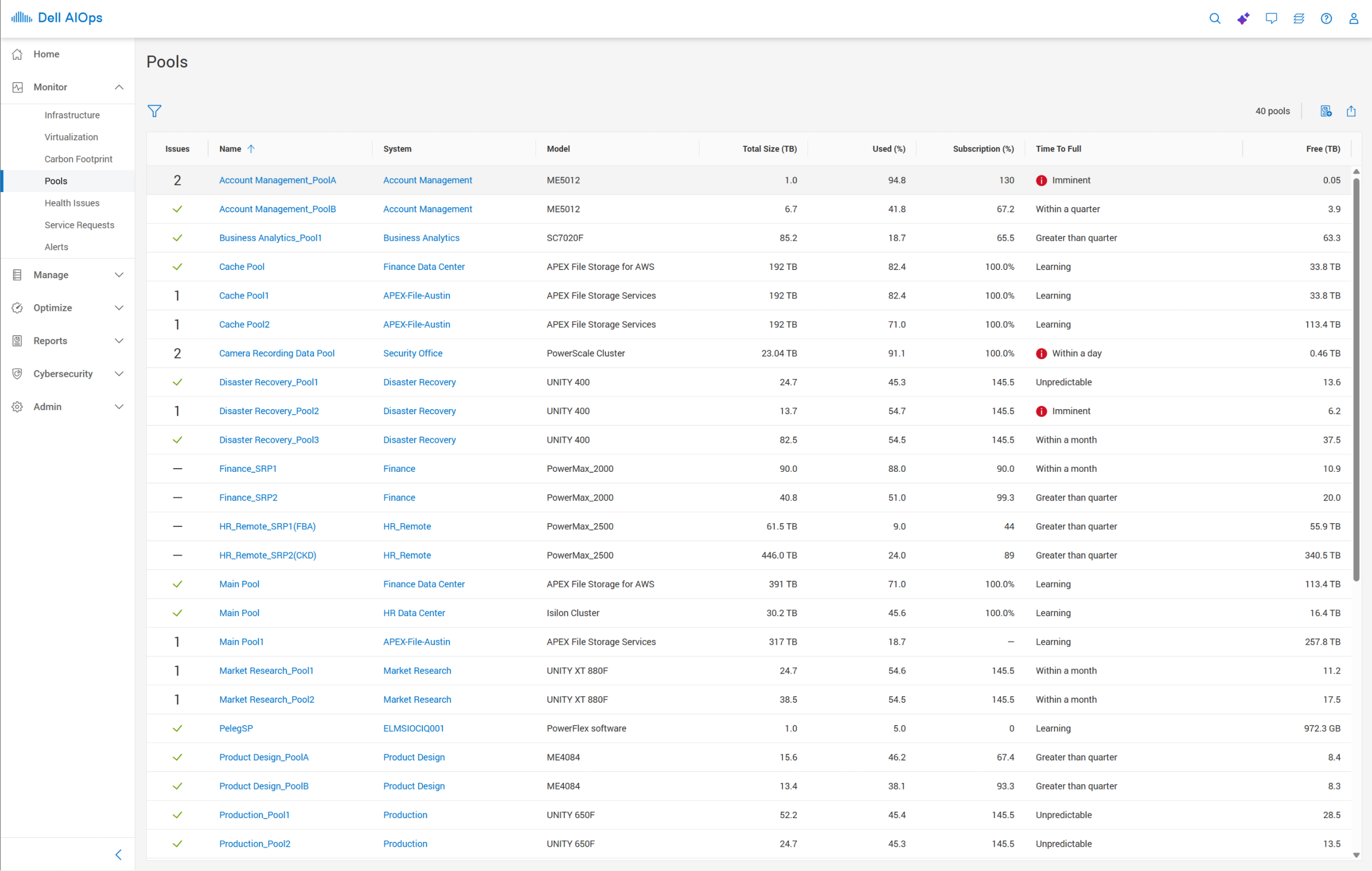
Extreme cognitive overload (too much text), low alert contrast.
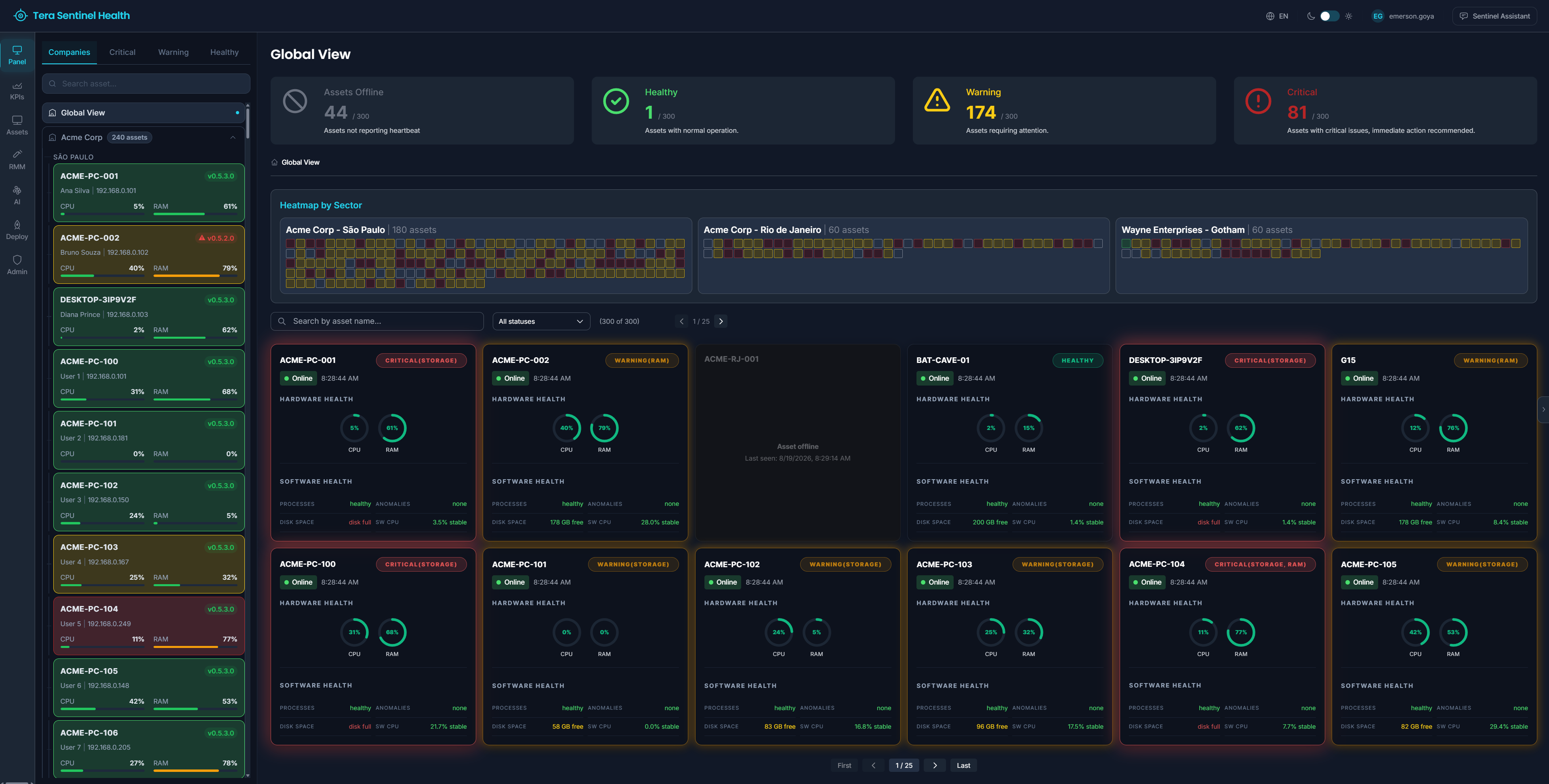
High-impact visual hierarchy and encapsulation of information (Cards vs Lists)
Click any image to open full size and compare details.
2. Semantic Tokens: Blocks That Know Their Purpose
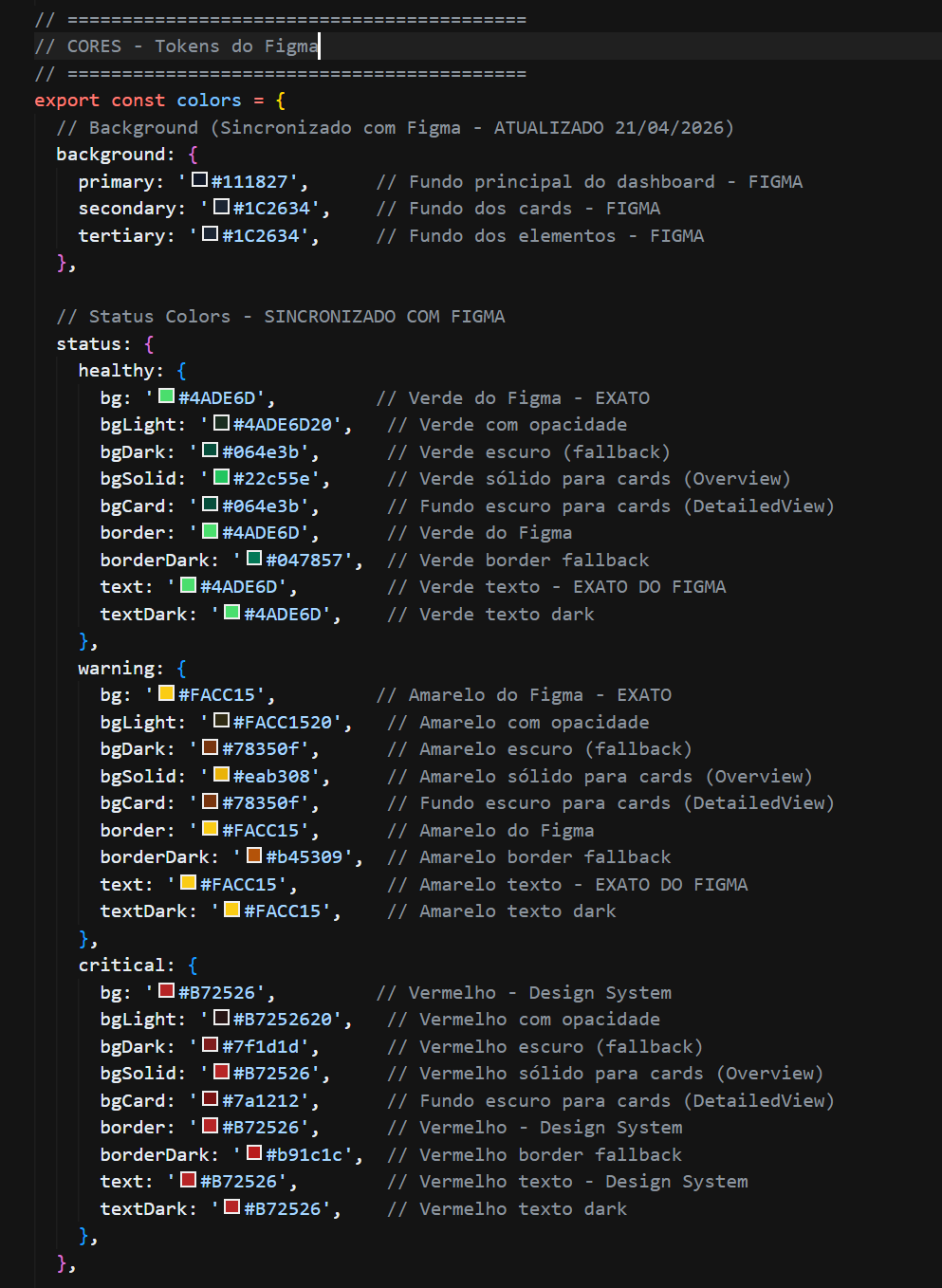
In most design systems, colors are given visual names: --green-500, --red-700. This works until you need to change a color and break twenty other places.
Sentinel uses semantic tokens. Each name explains why it exists, not just what color it is:
❌ Not semantic (appearance only)
--green-500:
          #22C55E
--red-700:
          #B72526
✅ Semantic (clear purpose)
--color-status-healthy-bg:
          #22C55E
--color-status-critical-text:
          #B72526
Why this decision?
Change management. A token named status-healthy tells the developer: this green means success. If you change the color, the change only affects success states. No hidden side effects.
Non-semantic names create risk. Changing green-500 can break a start button, a health badge, and a progress bar. Three things sharing a color by accident. You only find out in production.
Impact for developers
See how the choice for semantic names changes the day-to-day of those who implement it:
Faster decisions
When using the class or component
badge-status-healthy , the developer immediately knows it is a success indicator. The token automatically consumes the semantic text, background, and border variables
healthy-bright and healthy-bg-card, without needing to consult manual documentation.
Safer changes
Want to adjust the tone of the warning yellow?
Update the family --color-status-warning-* knowing it will affect only the warning components, without impacting critical or healthy colors, nor generating side effects in other system elements.
3. Architecture Decision: My Autonomous Design Squad
I replaced manual drawing in Figma with a flow where code is the living specification of the system. I directed artificial intelligence to automate the creation and auditing of components, freeing my time to focus on Design System architecture, token standardization, and accessibility rigor.
- UI Generator: creates components with semantic tokens.
- Design Critique: validates heuristics and WCAG.
- UX Copywriter: standardizes technical microcopy.
- RMM Technician Persona: simulates the user's real pain.
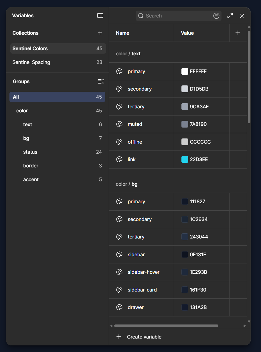
Semantic collections (Status, Surfaces, Typography) in Figma mirror tokens.css.
Auto-layout follows the 4px grid.
4. AI Decision: Autonomy with Human Refinement
While AI delivers speed and scale, my role is to ensure technical rigor and strategic vision. Supported by my training in Accessibility and Prompt Engineering from Dell Technologies, I treat WCAG 2.2 as the non-negotiable foundation of the architecture, not as a mere compliance checklist.
- Pipeline: Monitor → Analyst + Devil’s Advocate → Security + SRE → Remediation → Knowledge.
- Results: Cognitive-load reduction, 100% keyboard navigation, and AAA contrast on critical alerts.
- The trade-off: Badges and Cards explain exactly what the AI decided and why it decided it, keeping the human specialist always in control of the operation (human-in-the-loop).
Agent-Driven Status Transition
The same token used by the agent is the same one seen by the operator. This eliminates distortion between real state and screen.
5. Component Decision: From Raw Logs to Predictive Components
The interface must respond in under 6 seconds. The Badge answers whether it needs attention. The Card answers why.
Badges: A Decision in One Signal
Triple redundancy with icon, text, and color works for colorblind users and poor monitors.

- Critical uses
--color-status-critical-brandwhen it needs immediate action. - Warning uses
--color-status-warning-brightfor manageable anomalies. - Healthy uses
--color-status-healthy-brightwhen there is no intervention. - Offline uses
--color-status-offlinewhen there is no heartbeat.
Workstation G15, from Critical to Healthy
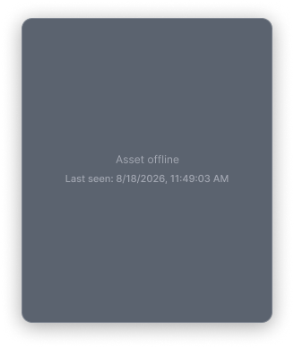
Asset G15: CPU 96%, RAM 92%, Process Crashed, 5 anomalies, Disk Space 95% full.
WARNING (CPU) was the right call; the AI executed recovery.
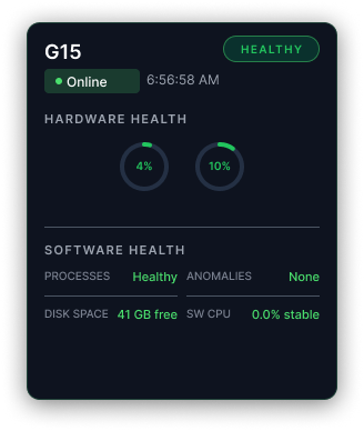
G15 autonomously changing from 'CRITICAL (CPU, RAM)' to 'HEALTHY' after an AI self-recovery routine.
6. Signaling: The Rigor of WCAG 2.2
WCAG 2.2 AA is the minimum. The challenge was to treat accessibility as a risk decision, not as a feature, for NOC operators.
- Cognitive-load reduction. Only what demands immediate action is visible.
- Keyboard-native. 100% keyboard navigation, with tokenized visible focus.
- AA contrast on critical alerts. Immediate distinction between states.
- Palette validated with 4 states, tested with a colorblind user.
WCAG 2.2 Level AA and above (Dark Mode)
Body text: 17.7:1 (exceeds AAA) | Secondary text: 12.0:1 (exceeds AA) | Auxiliary text: 4.54:1 (meets AA) | Focus: 9.8:1 (exceeds AA)
Color Calibration: Lived Accessibility
Because I have color blindness (deuteranopia), I know WCAG checklists are not enough. In Dark Mode, shades of blue, purple, and brown often blend for me. This real pain guided the visual strategy of the system.
- Absolute Contrast: I empirically calibrated vibrant tones (critical, warning, and healthy) to maximize distinction to the naked eye.
- Triple Redundancy: Because there are several types of color blindness, the system never relies exclusively on color. The non-negotiable rule is Triple Redundancy: Color + Shape/Icon + Text. The shade of green or red speeds up reading, but it is shape and text that guarantee accuracy for users.
7. Proof of Scale: Code as the Living Specification
The final test of a design system is production. With semantic tokens and reusable components, code became the living documentation.
- Trade-off: less freedom for a “quick fix” in JSX, more rigor in handoff.
- Gain: real cohesion across 500+ assets. QA, devs, and agents use the same source.
Atoms → Application (live board)
One surface, every layer: foundation tokens on the left, the real component
recipes in the middle (Button.tsx, Input.tsx, ui/Badge.tsx,
.card), production screens on the right. Rendered live - not a static mockup.
Open full board ↗
- values pulled from src/styles/tokens.css, tailwind.config.cjs and the components themselves.
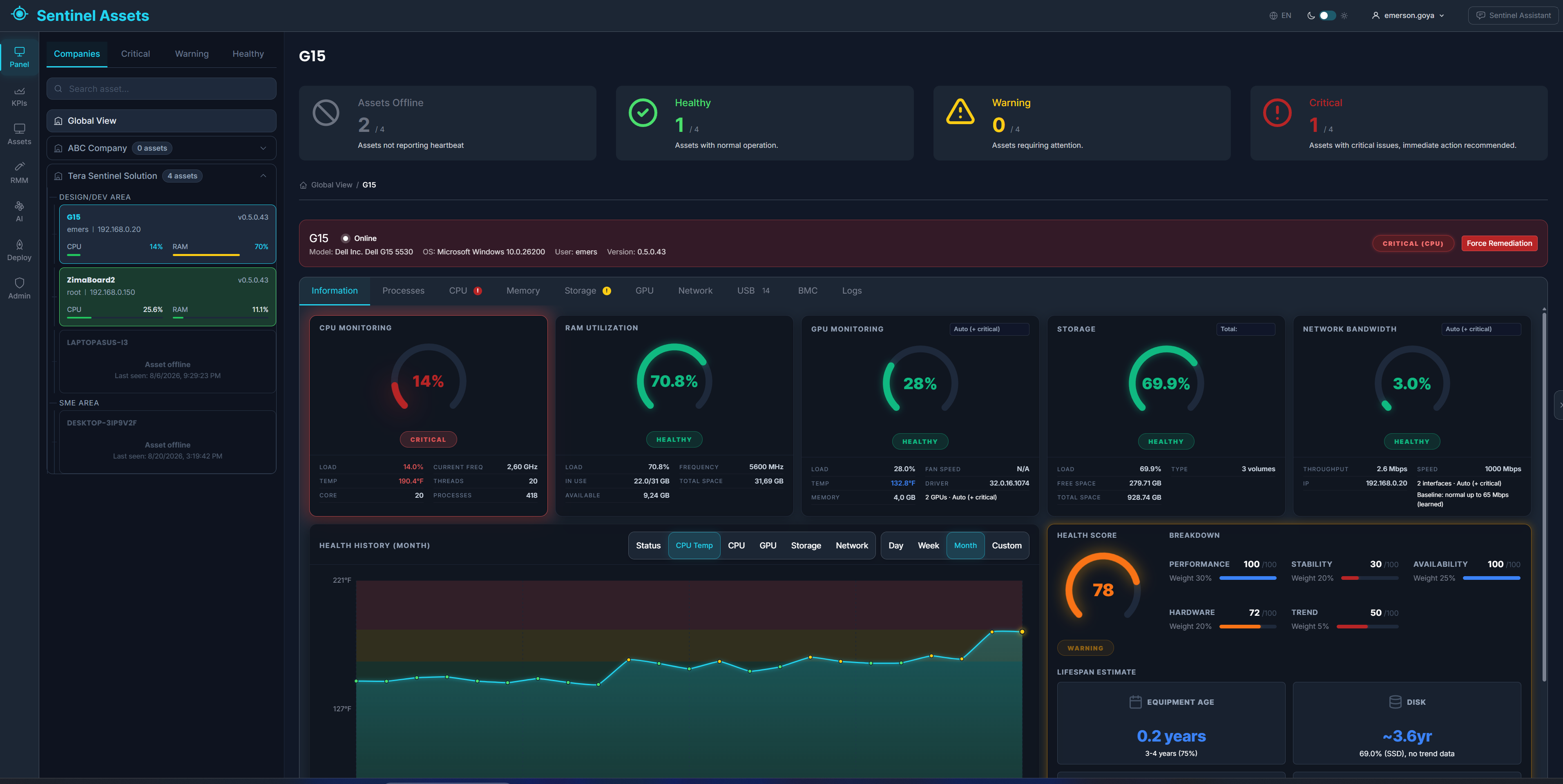
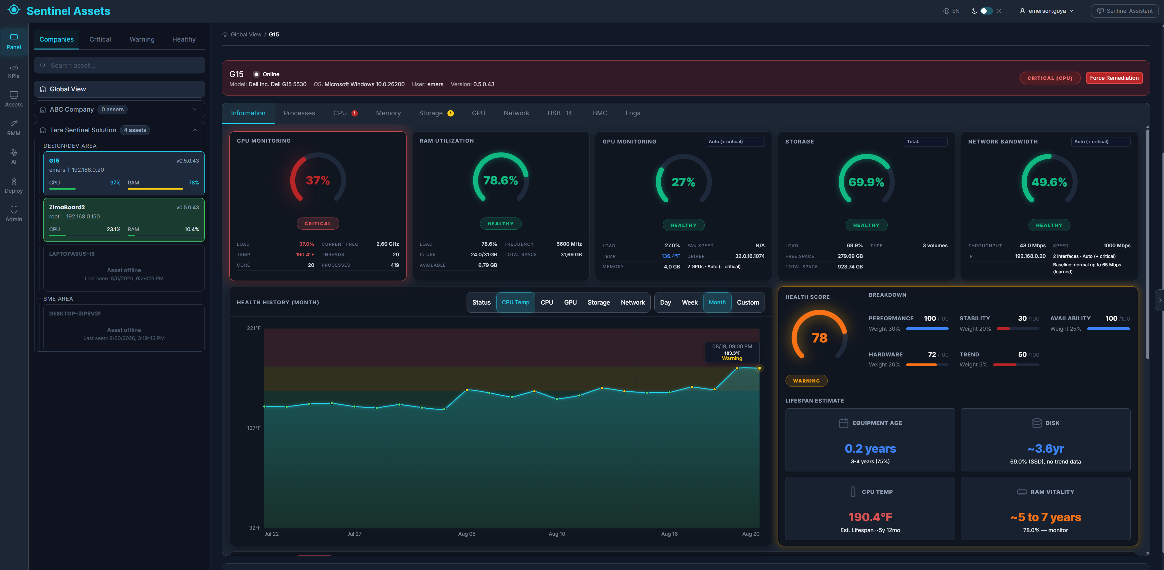
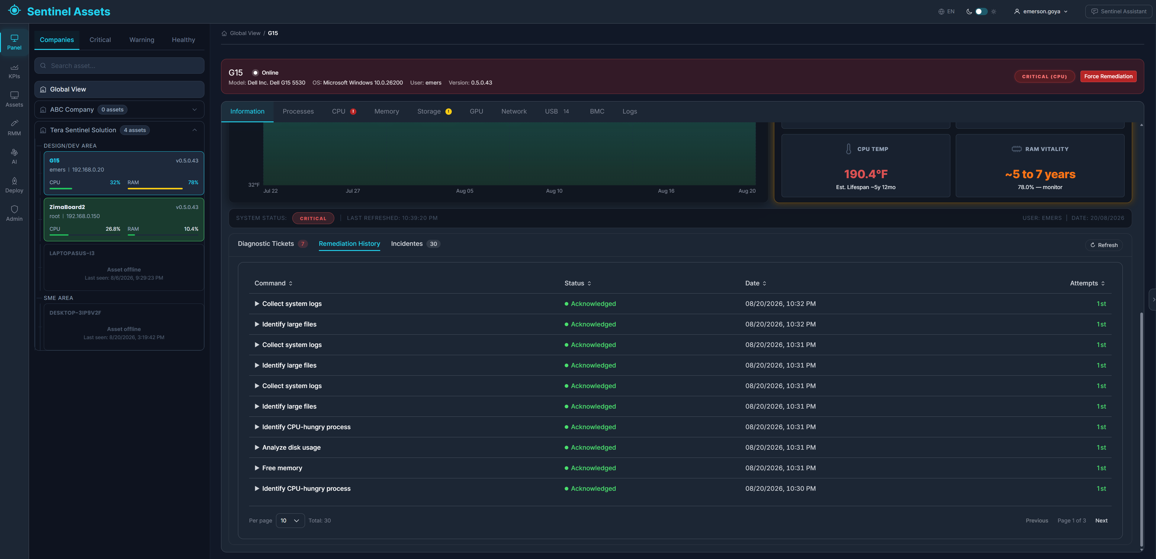
Dashboard View
Production UI with 300 assets, sector heatmaps and the same status tokens used by AI agents.
Component families powered by the same source:
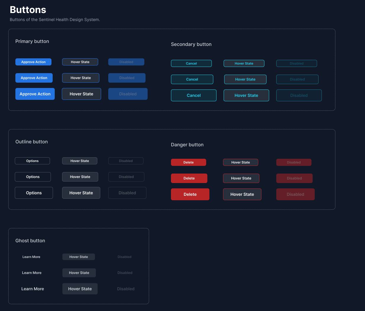 Buttons
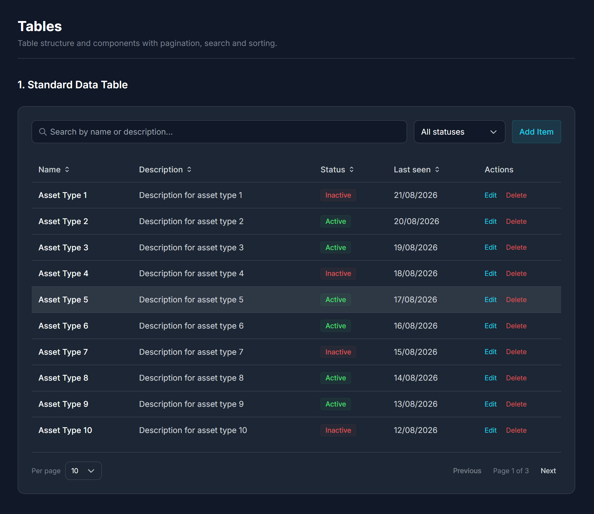 Tables
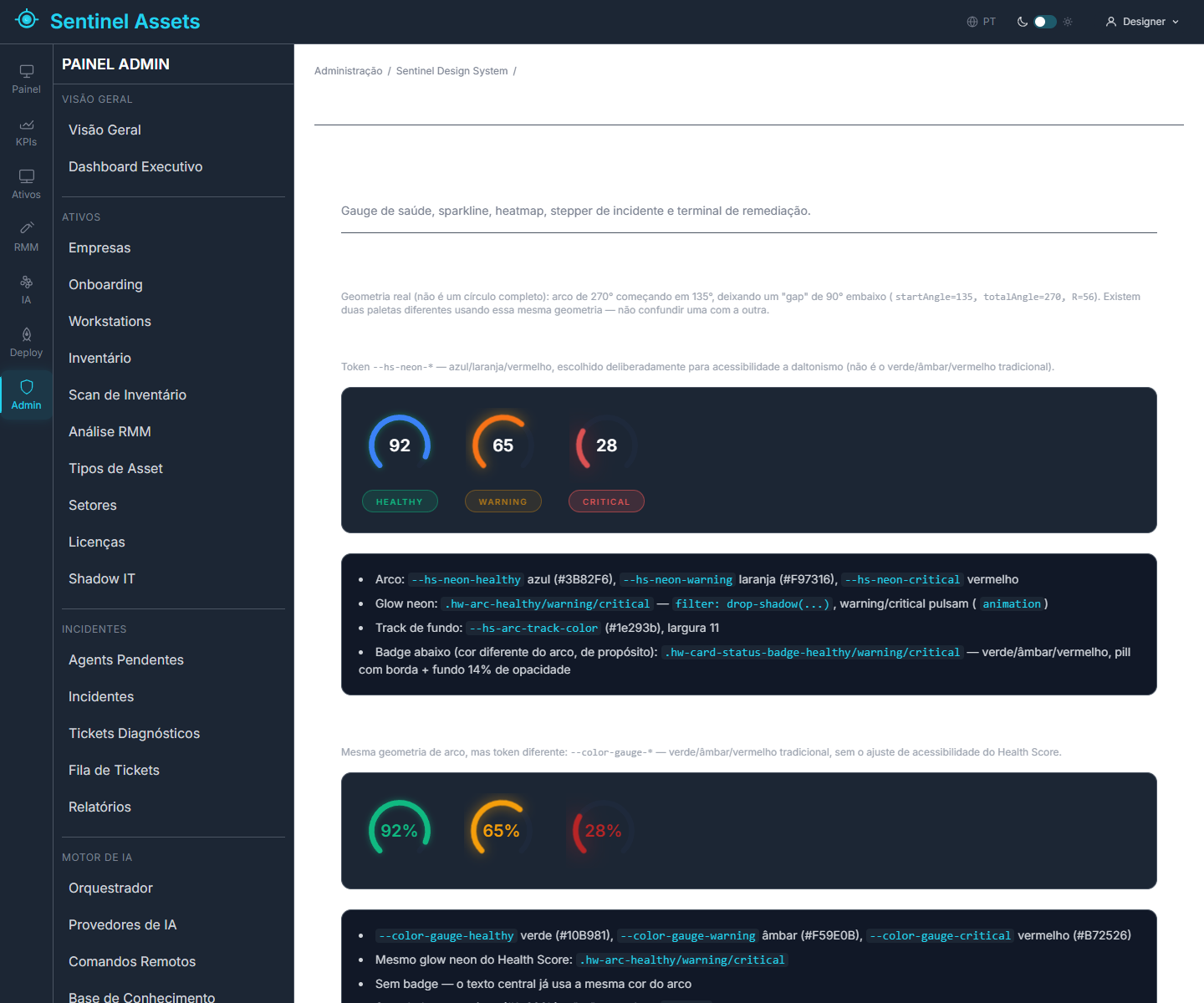 Data Viz
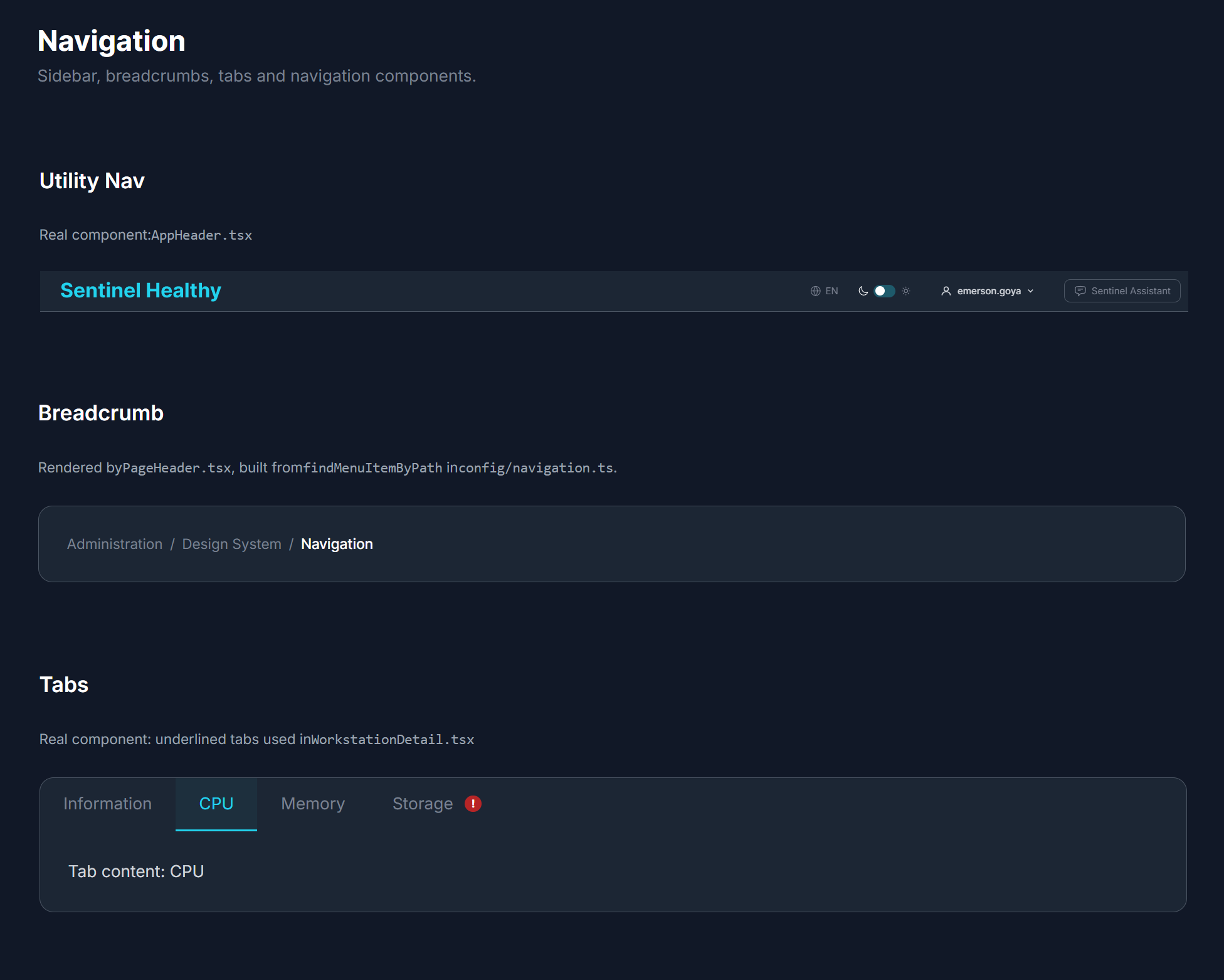 Navigation
8. Results, Business Impact, and What I Would Do Differently
AI accelerates execution, but mature design is what reduces operational uncertainty. The result is a product that scales without a human micromanaging every alert.
- Zero visual tech debt: 100% tokenized product supporting 500+ simultaneous assets on the same visual surface.
- The traditional handoff bottleneck (Figma ↔ Code) was broken. With the autonomous specification, we eliminated the manual rework cycle between design and engineering.
- Autonomy with Confidence: 95% of decisions are resolved by agents; the specialist focuses only on edge cases, drastically reducing response time to critical incidents.
Lessons Learned (What I Would Do Differently Today)
- Native mode: I would prioritize cleaning legacy hardcodes earlier to deliver a flawless theme switch.
- Micro-interactions: I would add intentional motion to further smooth the cognitive load during status transitions (critical → healthy).
- Density modes: I would create grid variations (ultra-compact view for NOC operations and relaxed view for executive reports).
Conclusion
In production, design is not about drawing pretty screens; it is about translating business constraints and accessibility into fast visual decisions. By placing human rigor validating AI speed, I built a system that truly solves the "Matrix syndrome": the specialist does not need to be in every step, because the system already understands what is critical.